Introduction to the project

Tier 2 cities have become the next hub for an essential FMCG re-edit. The more aware middle class prefers well branded products that convey quality and distinction from the usual. Strategically positioned to give a competitive edge to hyperlocal players, Dairy is a daily household product that works best when it is built on a sense of familiarity and trust. We built Dairysmith to resonate the values of trust, transparency and quality, keeping in line with the brand expansion plans.

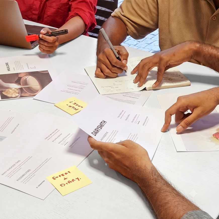
Research & insights

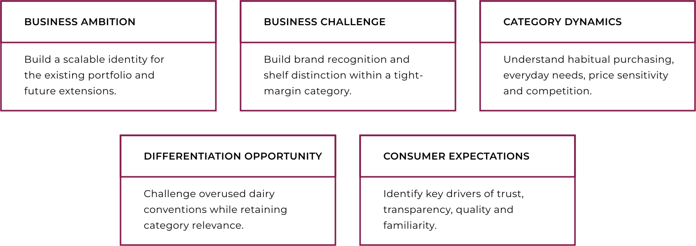
The rational and emotional findings were brought together to identify the opportunity for Dairysmith and establish its strategic direction.
This led to a positioning built around trust, transparency, freshness and quality.

Strategic Foundations

Strategic Direction

Brand Positioning
Brand Philosophy: Establish a positioning rooted in trust, transparency and quality.

Emotional Territory: Build familiarity and reassurance around everyday dairy consumption.

Scalability: Create a cohesive positioning adaptable to future product extensions.
Brand Growth
& Experience
Shelf Presence: Strengthen visibility and differentiation at the point of purchase.

Consistency: Maintain a cohesive identity across packaging and consumer touchpoints.

Efficient Growth: Establish a scalable system that supports portfolio expansion and reduces reliance on large advertising investments.
Brand Identity Direction
Typography: Prioritise legibility, clarity and recognition.

Brandmark & Iconmark: Express dairy’s fluidity and familiarity through a playful, contemporary identity.

Colour Strategy: Use a minimal colour palette to create distinction while simplifying printing requirements and helping optimise production costs.

Visual Differentiation: Reinterpret familiar dairy cues through a distinctive, modern visual language.

Brand Naming

DAIRYSMITH
The name was chosen for its simplicity, recall and ability to reflect the brand’s purpose. With dairy-based farming expertise and a focus on sourcing from local farmers, the name had to reflect the brand’s purpose and quality, the name is versatile enough to grow across B2B, B2C and international markets.

Identity

A new brand becomes more acceptable when it is personalised with a human quality.
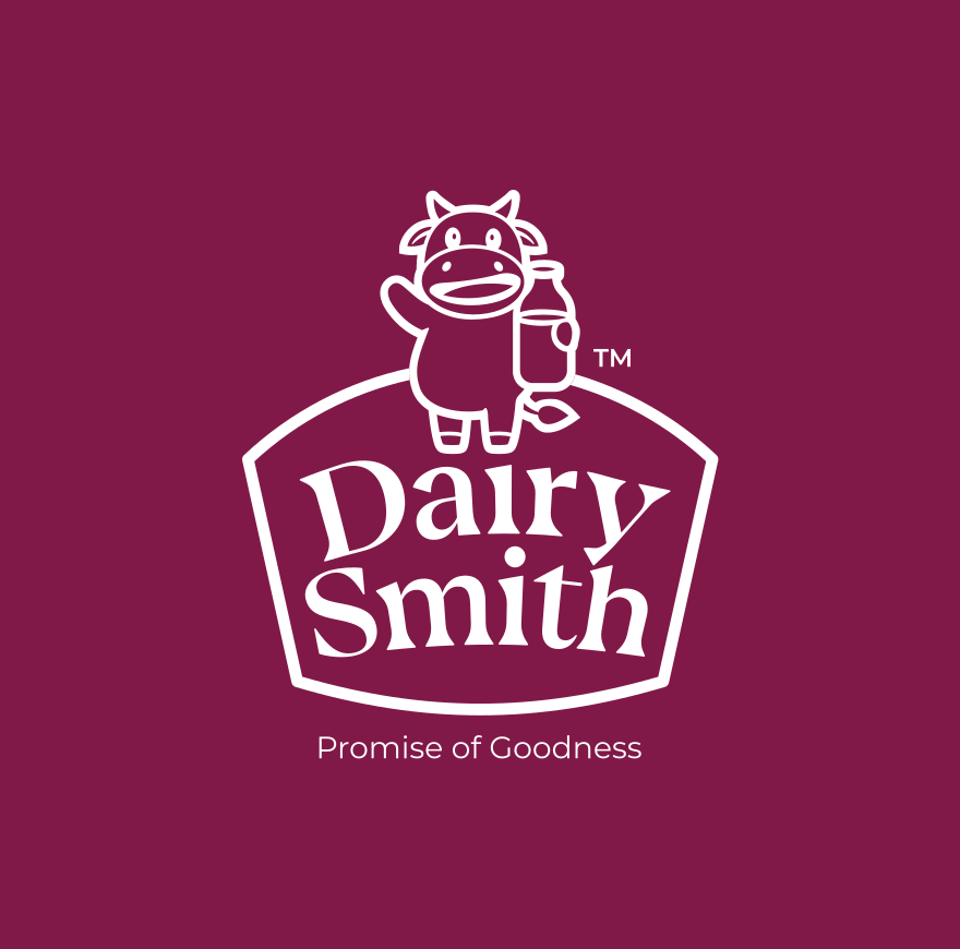
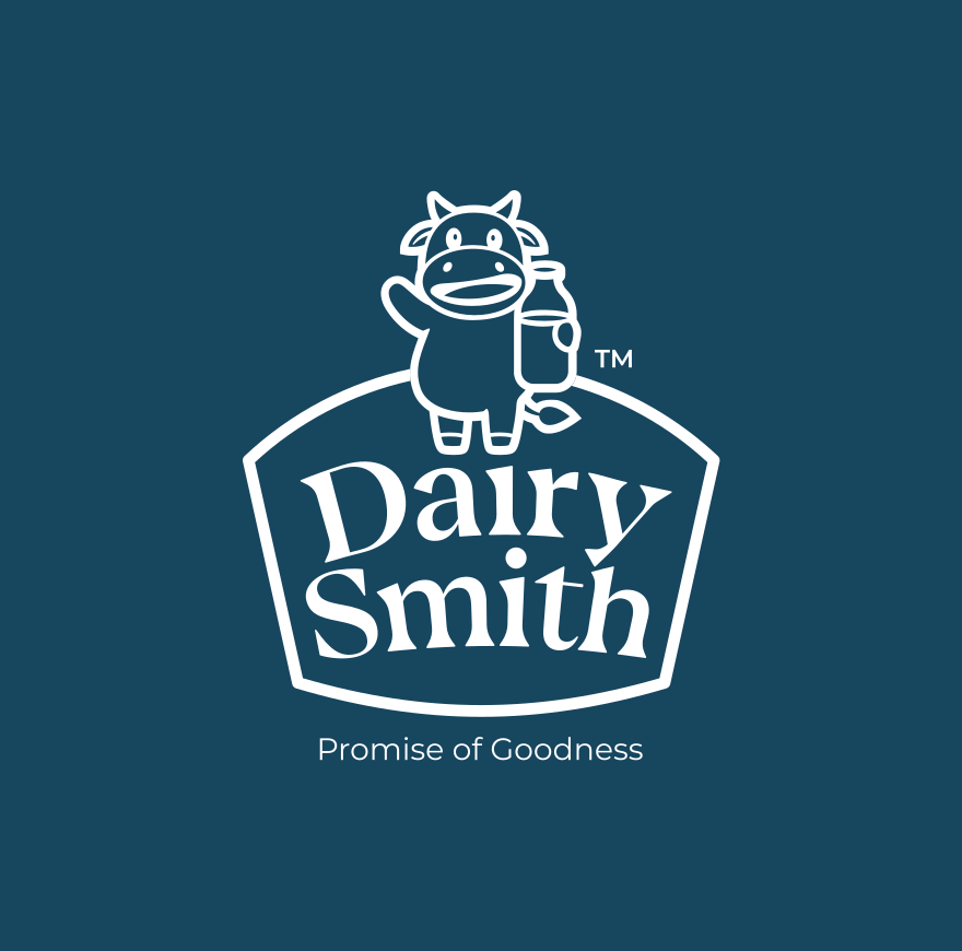
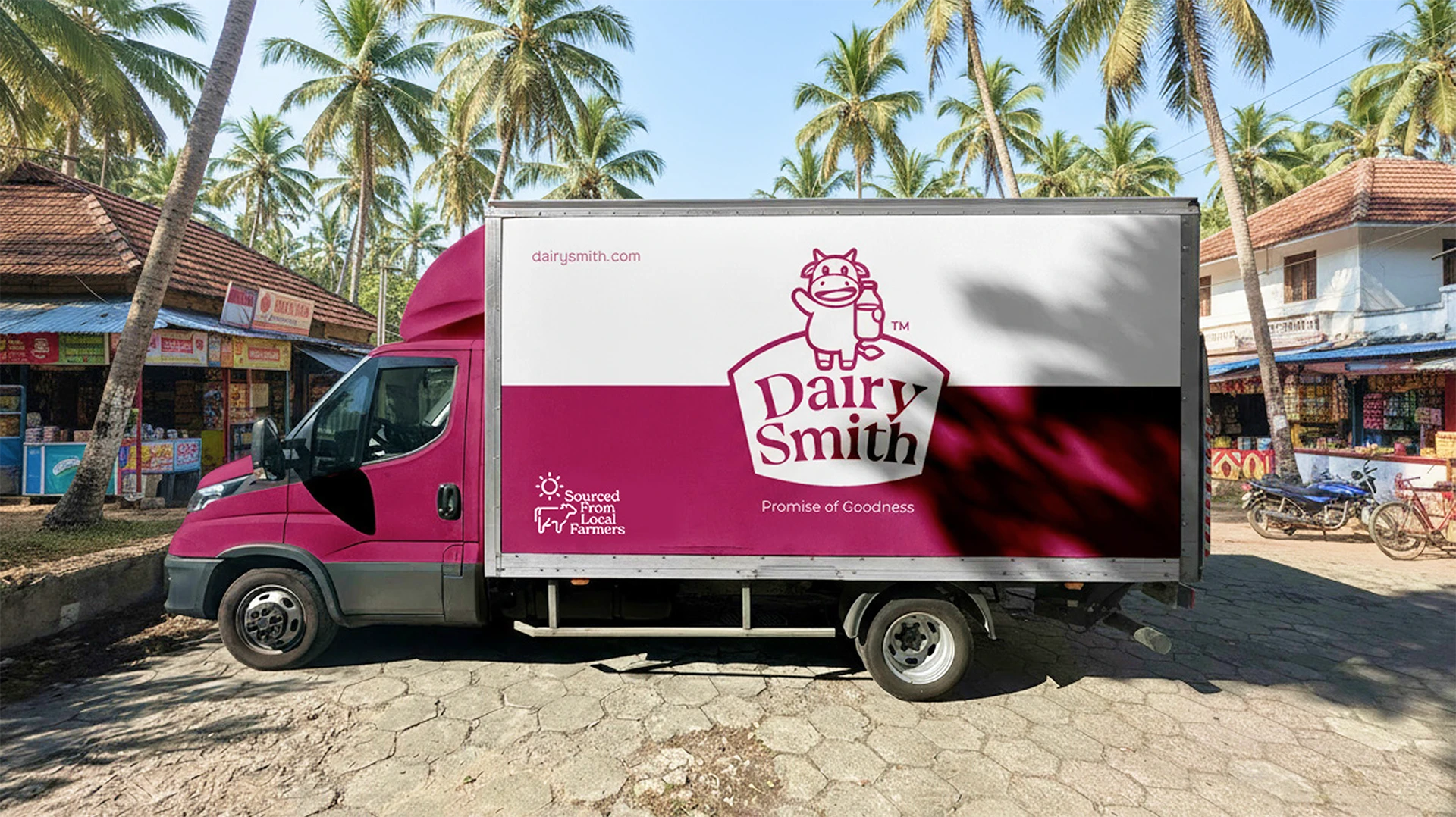
With a joyous cow mascot, the Dairysmith identity was created keeping the relatability of the product at its core, while creating quick recognition across the category. The brandmark also echoes the brand offering, collected from farmers and delivered fresh.

Package design

The rack value of a new product is defined by the visual psychology employed.
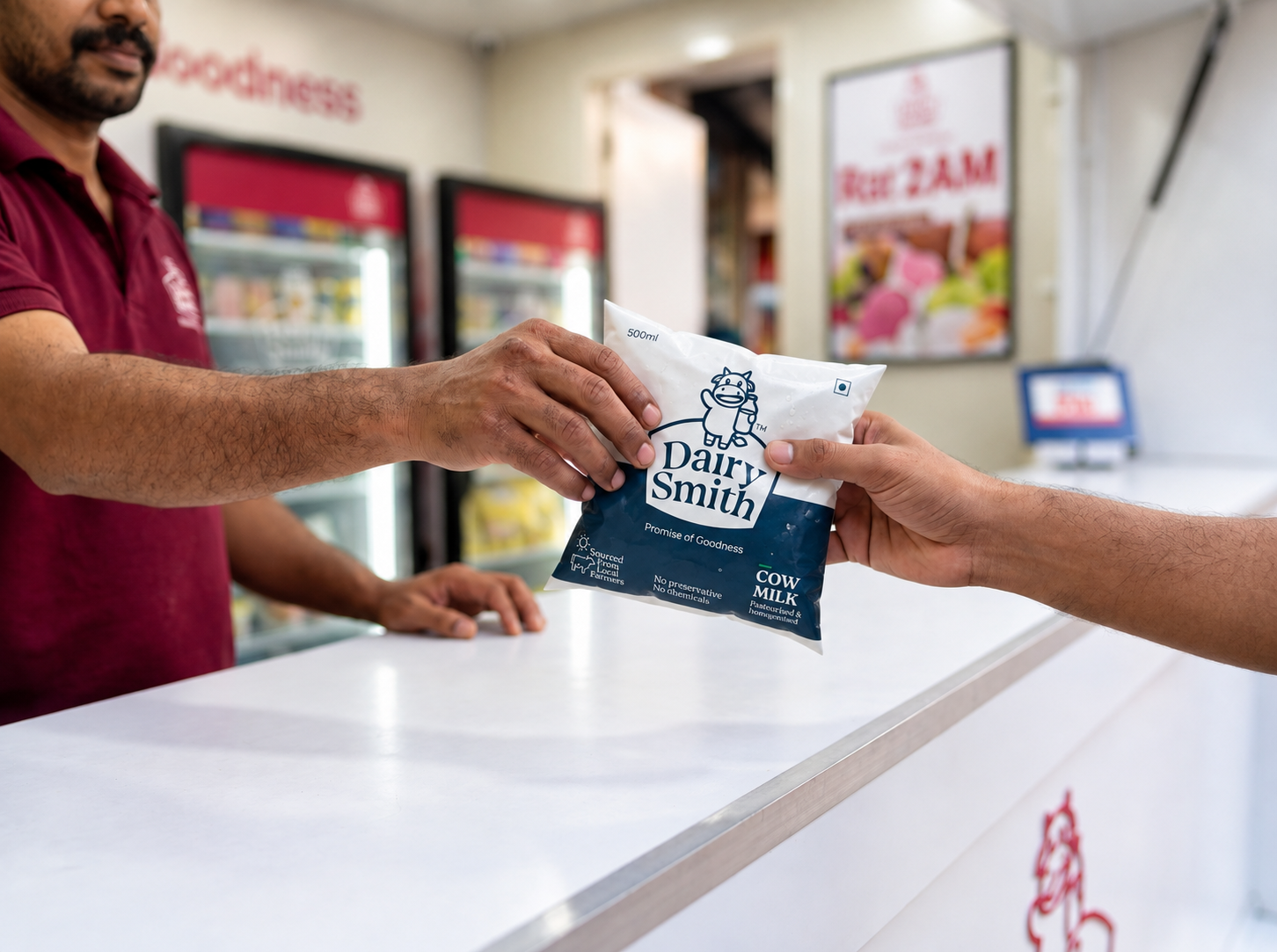
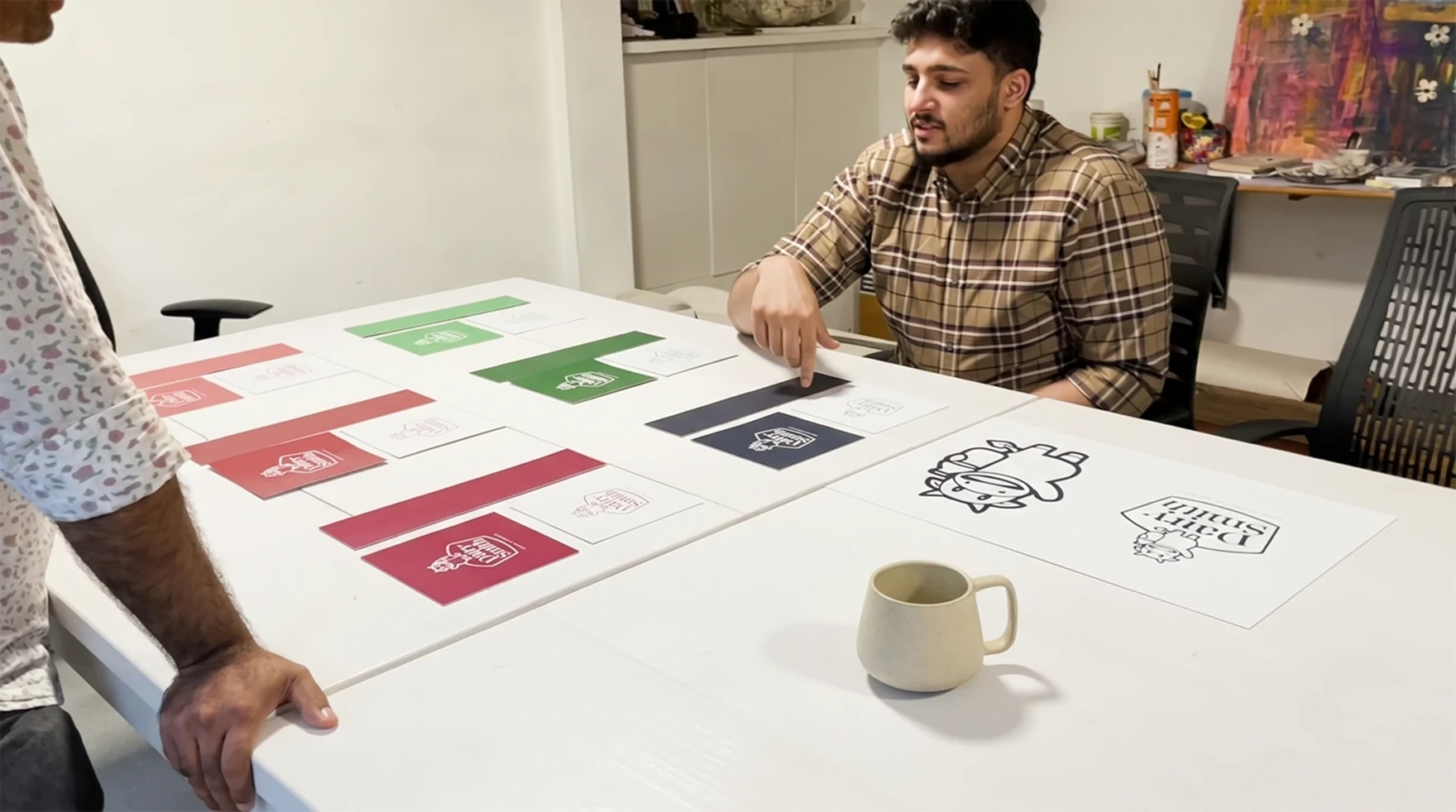
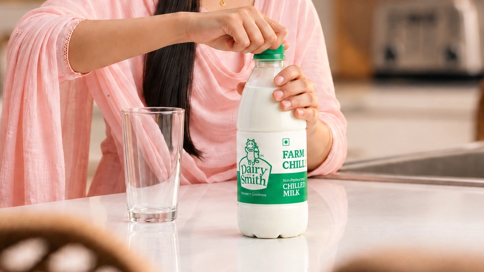
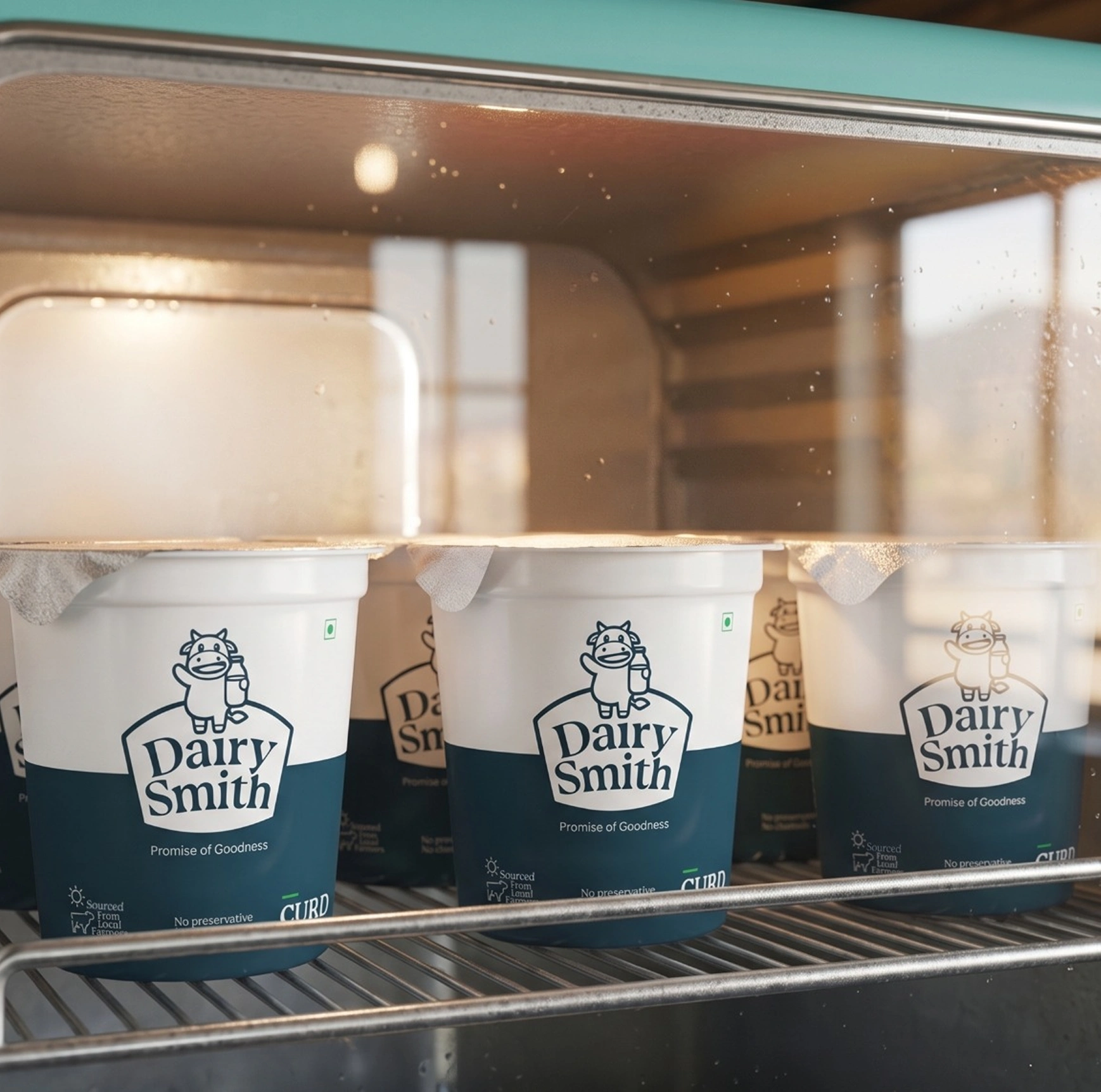
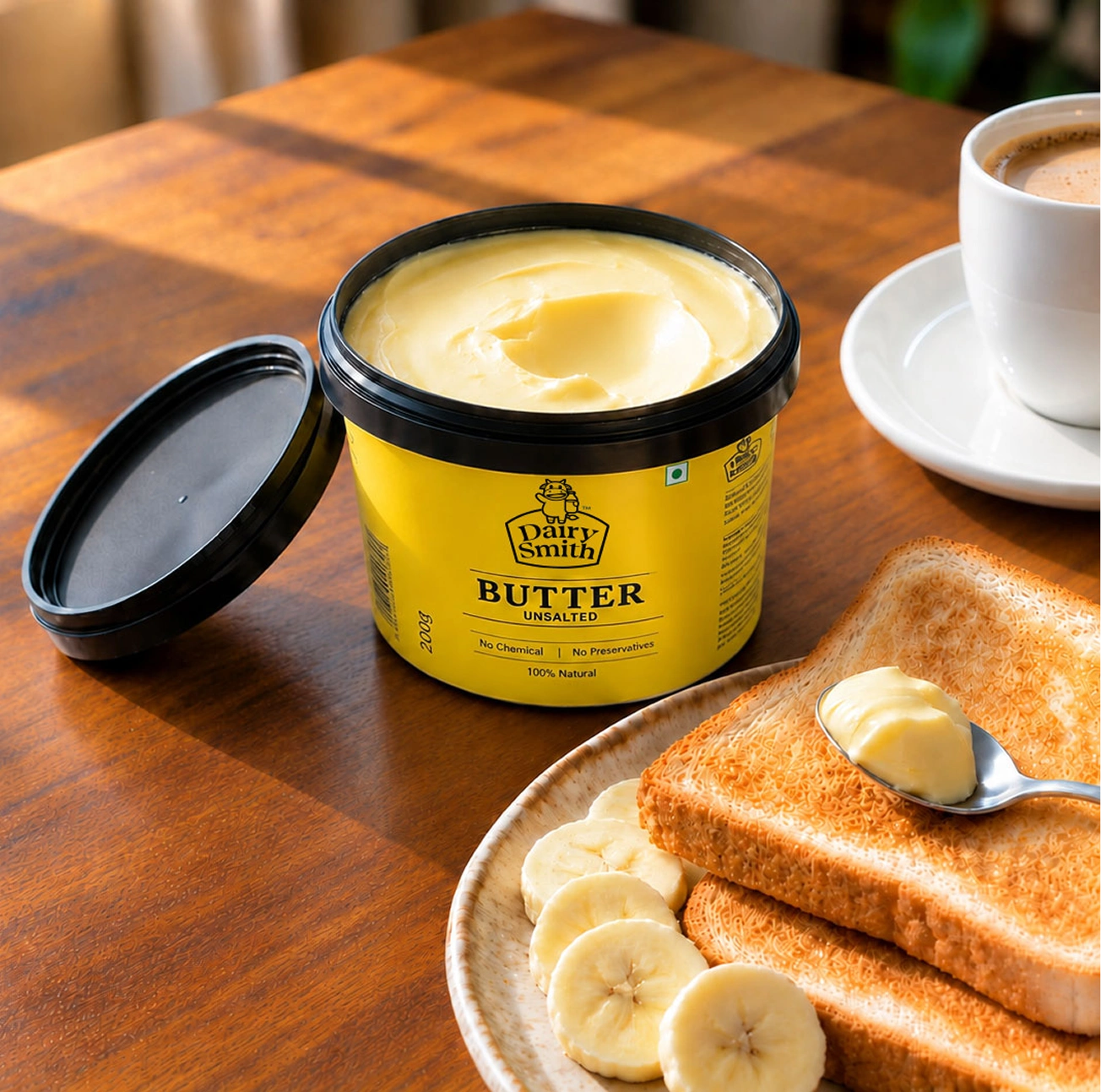
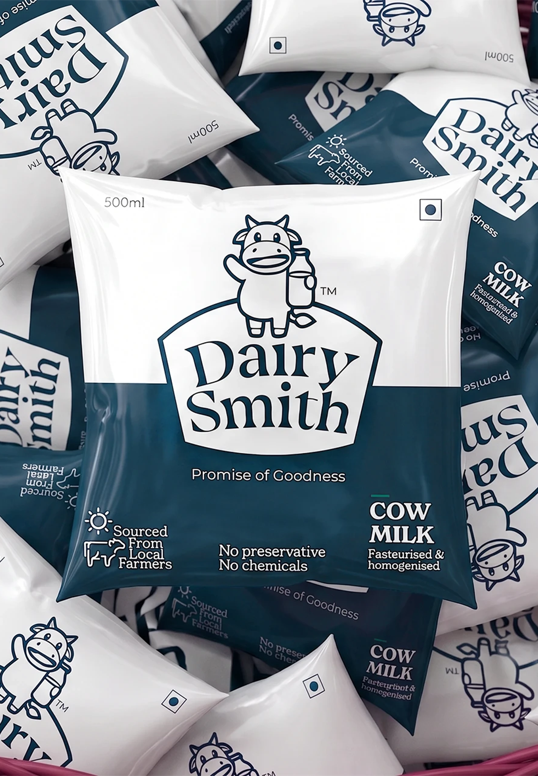
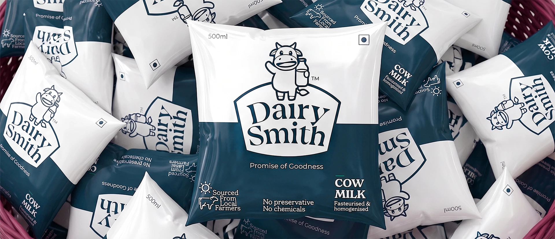
We designed the Dairysmith product range, keeping the values of the brand and the variations within each product in mind. This is achieved by blocking the primary colours against white while placing the logo centrally to create prominence and quick brand recognition.The system is designed to differentiate each product through colour while maintaining overall brand recognition, allowing individual packs to stand out while working cohesively as a range. An expansive framework has been created strategically so new SKUs and product category additions can be easily designed, while also considering production requirements and cost to ensure the system remains both efficient and cost effective.

Instore Experience

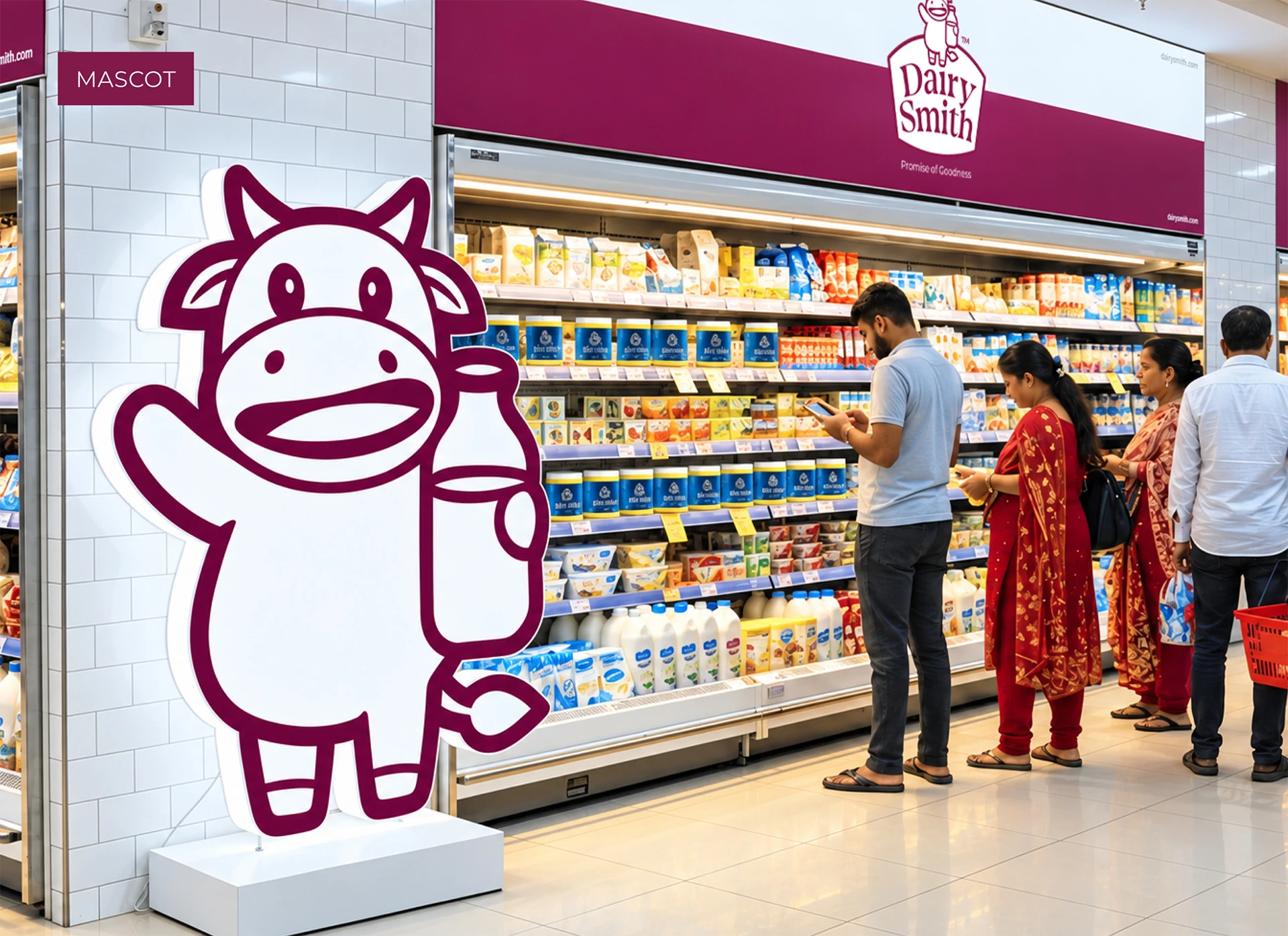
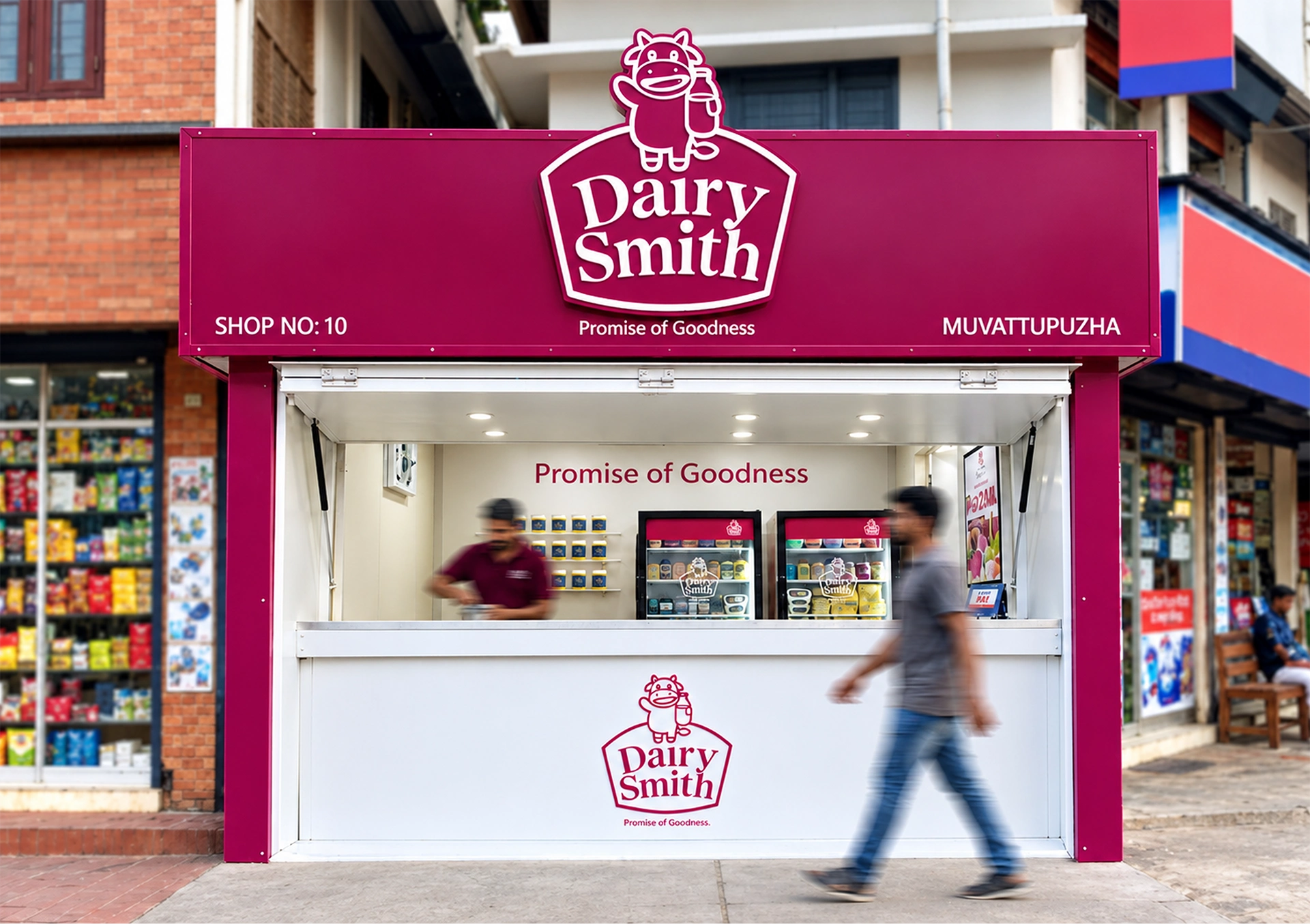
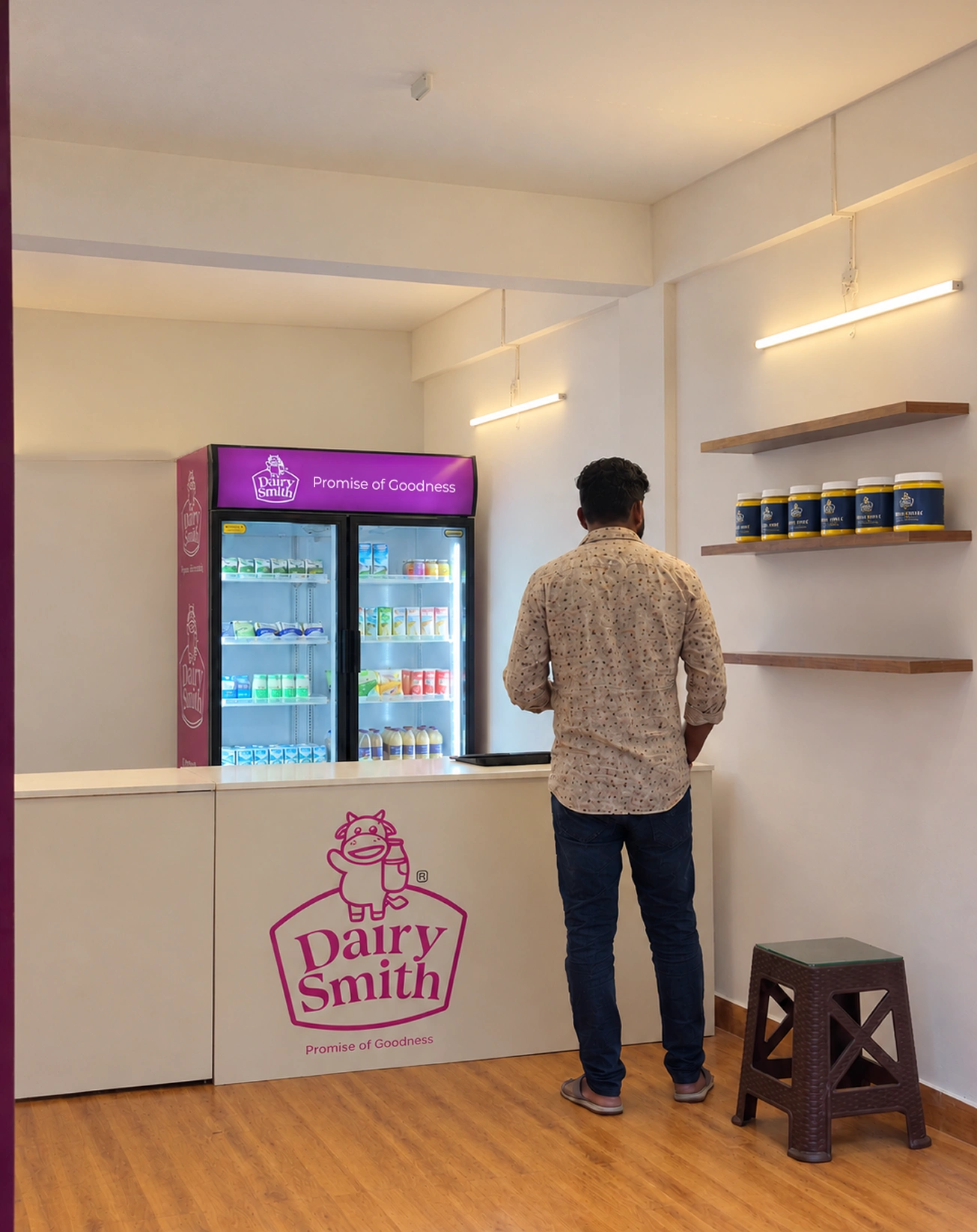
The physical retail environment is an extension of the brand experience, especially for a category like dairy where purchase is often habitual and driven by familiarity and trust.
The Dairysmith identity was therefore extended into the retail and outlet environment to create consistency between the pack and the point of purchase.

The same visual language, colour system and emotional character were carried across interactions, allowing the joyous and approachable personality of the brand to remain recognisable beyond the packaging. The intent was to make every interaction with DairySmith feel like part of the same brand world.
Implementation

A strong identity is only as effective as its ability to remain consistent in the real world. The Dairysmith system was tested across users, applications and production requirements to ensure that the identity remained recognisable, practical and adaptable. Colour specifications, print requirements and production considerations were carefully worked through with printers to establish clear implementation standards. The final guidelines were developed as a flexible framework that allows the brand to maintain consistency while accommodating new products, formats, environments and future extensions.

Conclusion

Dairysmith transforms a regional dairy business into a distinctive brand built on quality and recognition.
Dairysmith reflects the potential of design to shape how a business is perceived within an established category. In a market driven by daily consumption and deeply held expectations of quality, the brand creates an opportunity to build equity around the value of dairy itself. Its larger ambition lies in elevating a regional dairy business into a brand with its own standing, capable of shaping consumer preference and commanding recognition in a category where familiarity often determines choice.

Related Projects

Let’s talk innovation!

Feel free to reach us to explore an idea, or a product/service.
We will be happy to explore it with you.