The internal design translated the conceptual direction into a consistent editorial system across the inner title, dedication, index, foreword, reflections, stories and about section.
The layouts were developed around the structure of the content, giving the reader a clear progression through the design while maintaining continuity with the cover's visual language.
Each reflection was paired with an affirmation, creating a deliberate relationship between the insight and its personal application.

Typography, spacing and alignment were considered to support readability and give each thought sufficient room on the page. Central alignment was explored as part of the publication's visual system, helping establish consistency across the layouts and providing a framework that could be adapted for future volumes.

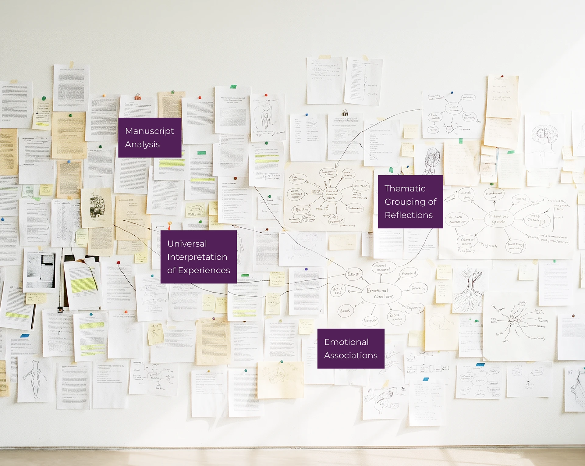
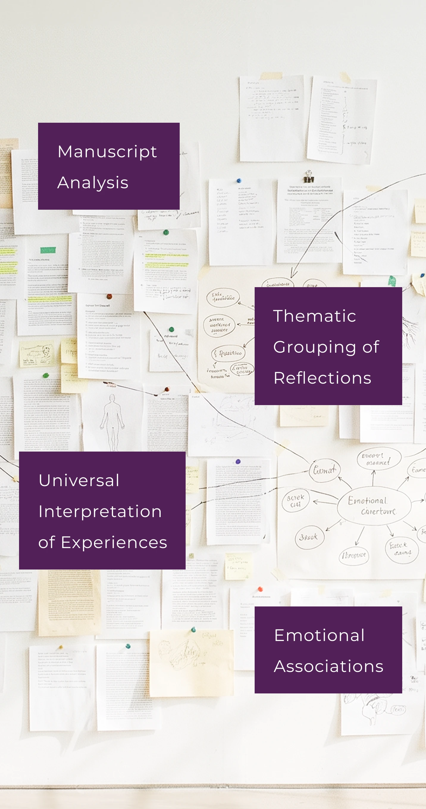
Black-and-white illustrations formed an integral part of the internal visual language. Their restrained treatment allowed the ideas to remain central while giving the pages visual character. This approach also considered the cognitive experience of reading, using visual associations to support the interpretation and recall of abstract ideas. The illustration style and page layouts were developed together, balancing visual interest, legibility and print production considerations.
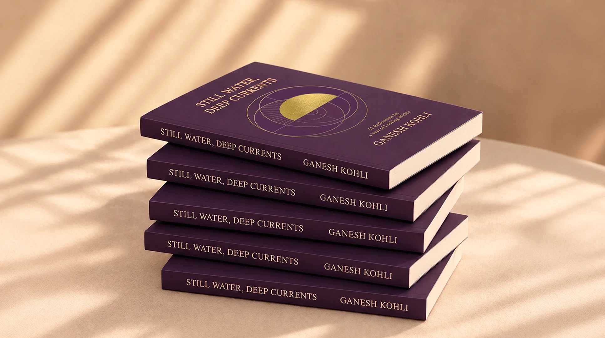
The production process translated the publication's conceptual and editorial direction into a considered physical object.
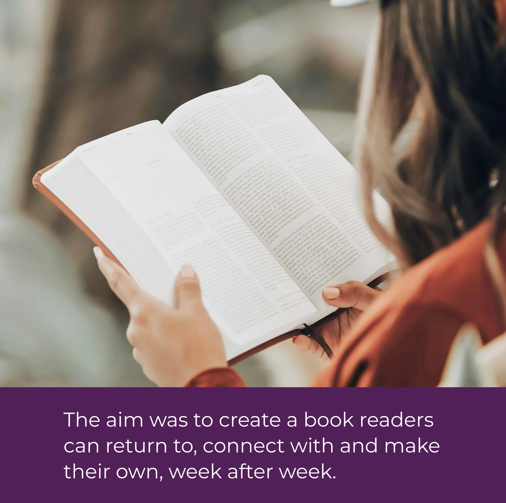
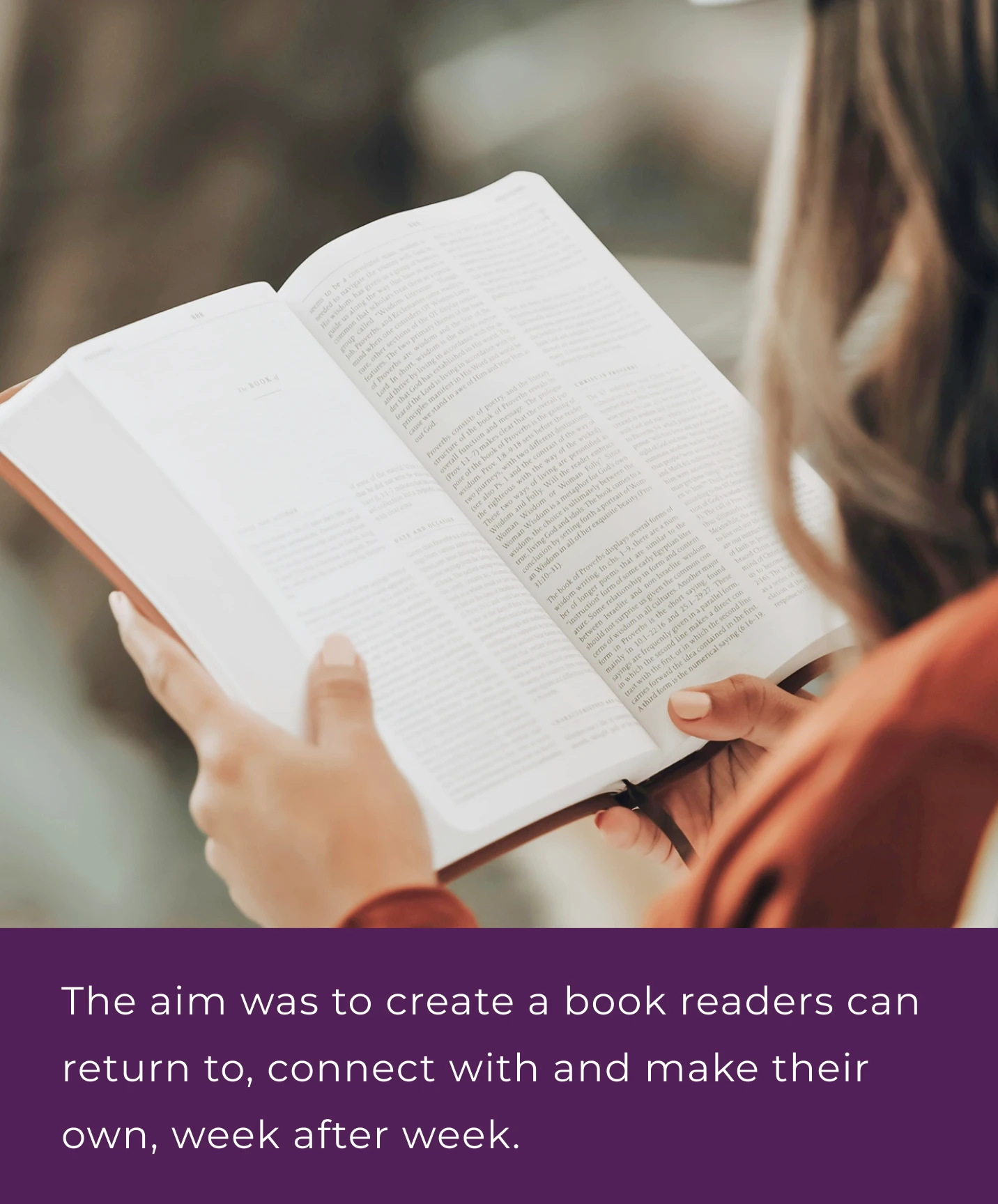
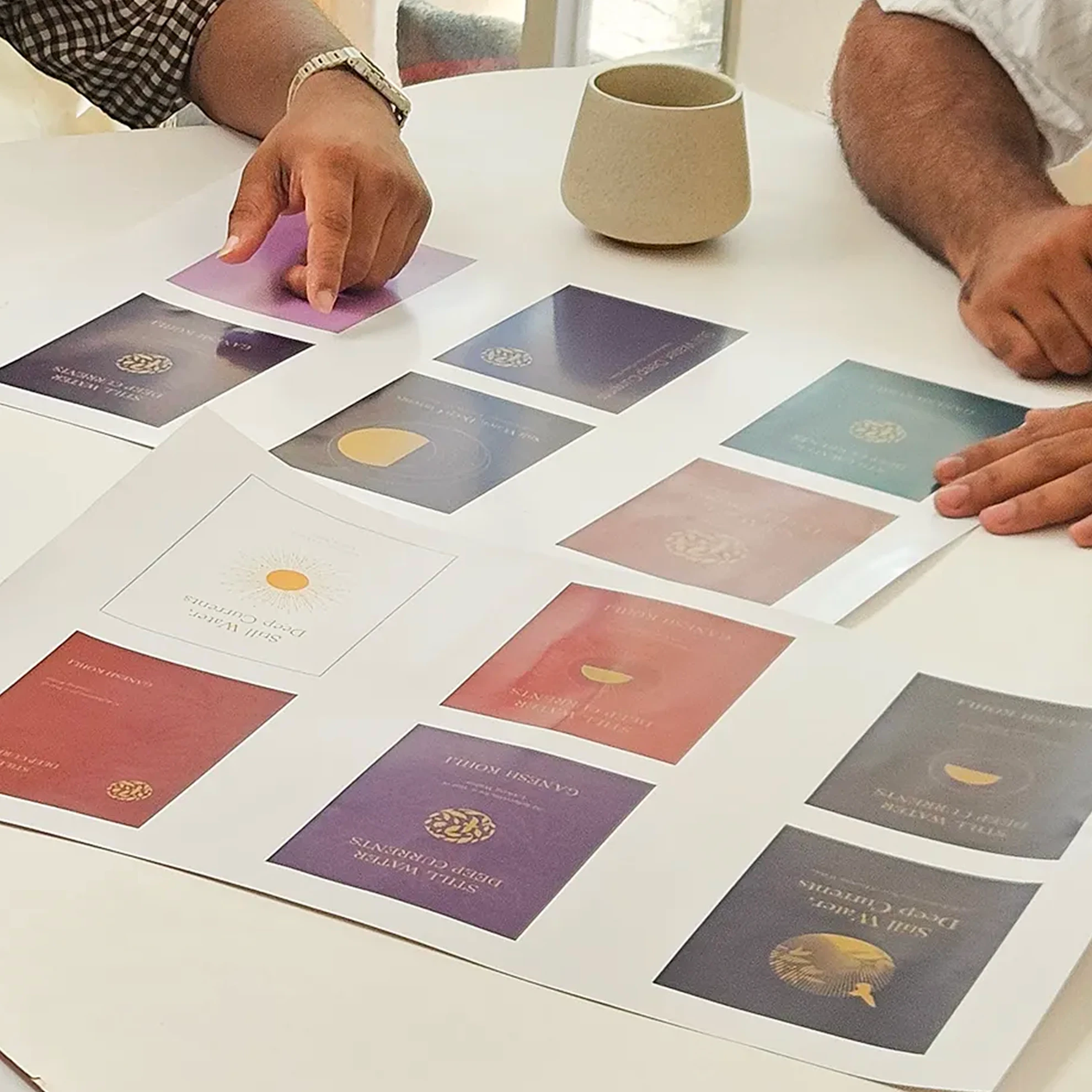
Typography, format and materiality were evaluated in relation to how the book would be read, handled and revisited over the course of a year. Typeface variations, font sizes and layouts were tested through print samples and user evaluation to assess readability, while paper samples were examined for tonal quality, weight, density and their ability to reproduce the internal illustrations.
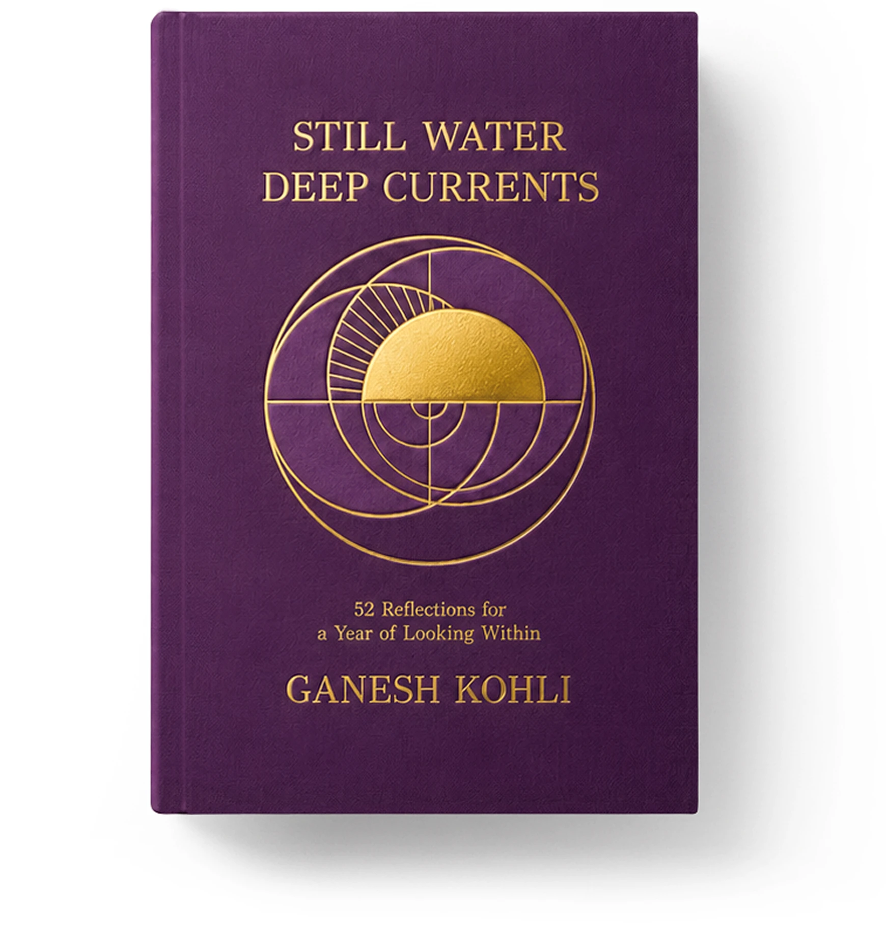
The cover's material treatment extended the visual identity into the tactile experience of the book. Saturated purple is paired with gold foil and embossing, and each finish was tested in samples to see how colour, texture and surface treatment work together. Internal paper specifications were similarly evaluated to balance illustration reproduction, readability, the finished book's thickness and production costs.
Material sourcing, print specifications, finishing requirements, publication compliance and delivery logistics were coordinated as part of the design process, carrying the conceptual intent through to the finished book within the practical requirements of cost, schedule and delivery to Mumbai.